Theming
This starter kit provides a collection of custom theme presets to choose from, built using the powerful PrimeVue V4 theming system. It leverages styled mode and custom design token values to create flexible and cohesive UI designs.
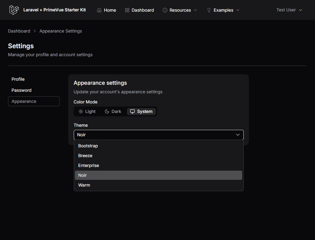
Provided Theme Presets
The theme presets are located in the resources/js/theme directory. Each preset offers a distinct visual style:
Bootstrap
Emulates the look and feel of Bootstrap.
Breeze
Captures the aesthetic of Laravel Breeze. (R.I.P. 🙏)
Enterprise
Provides a clean, no-nonsense corporate design.
Noir
A minimal & clean monochromatic style that serves as the default theme.
Warm
A boxy design with a warmer color pallette.
Change the Theme Preset
Changing the site theme can be accomplished by simply updating the preset module used within resources/js/app.ts:
import { useSiteColorMode } from '@/composables/useSiteColorMode'
import globalPt from '@/theme/global-pt'
import themePreset from '@/theme/noir-preset'
import themePreset from '@/theme/bootstrap-preset' // your desired preset
Customizing Your Own Theme
Creating your own theme preset is simple. You can:
- Swap the primary values with a different set of colors.
- Adjust the
colorSchemesurface values (e.g., slate, gray, neutral). - Change the extended preset theme.
For detailed guidance on customization, please refer to the PrimeVue Styled Mode Docs.
Demo - Theme Selector
The demo application appearance settings page (/settings/appearance route) provides a theme selector to showcase the provided preset options.
PrimeVue v4 w/ Tailwind CSS
To clarify, Tailwind is not used for any component styling in this starter kit; instead, we use PrimeVue's styled mode with a custom theme preset implementation for component styling. Tailwind is applied solely for layout purposes around PrimeVue components and for minimal styling when needed.